Monday 25 January 2010

Adding ribbon items into existing tabs/groups (ribbon customization part 2)

[This post updated September 2011 with fixes + extra info – see text for details]

In this article series:

  1. Customizing the ribbon – creating tabs, groups and controls
  2. Adding ribbon items into existing tabs/groups (this post)
  3. Ribbon customizations - dropdown controls, Client Object Model and JavaScript Page Components
  4. Customize the ribbon programmatically from web parts and field controls 
  5. ** Oct 2011 - Download the code samples in this series (and more) ** 

This is the second article in my series on ribbon customization. Last time we looked in detail at creating custom tabs, and in the course of that also looked at how to create "groups" on a tab, and also how to add controls. We mentioned that the container hierarchy is ribbon > tab > group > controls, and showed how to create all of those in my example (which also used SP.UI.Status/SP.UI.Notify in the Client OM). The XML there was fairly extensive, but in this post we’ll see things are somewhat simpler if you don’t need to create an entire tab and instead only need to add something into an existing area of the ribbon. Here we cover the two main scenarios:

  • Adding a group to an existing tab
  • Adding controls to an existing group on an existing tab

Also, the last post covered a lot of ground on creating new tabs etc. but I didn't get to cover something which I wanted to, so we'll mop that up here:

  • Creating contextual tabs

Summary of approach – customizing existing ribbon areas

In order to slot your customizations into existing places, the following approach is used (I’ve broken it down, but in reality you’ll probably do some of this cross-referencing automatically once you understand the relationship between various chunks of ribbon XML and the result):

  1. Identify the location you wish to add your customization(s) toDefault Ribbon Customization Locations has a granular list, but I find it easier to first identify just the tab you’re shooting for from the list below (taken from CMDUI.XML):
    • Ribbon.Read
    • Ribbon.BDCAdmin
    • Ribbon.DocLibListFormEdit
    • Ribbon.ListForm.Display
    • Ribbon.ListForm.Edit
    • Ribbon.PostListForm.Edit
    • Ribbon.SvcApp
    • Ribbon.Solution
    • Ribbon.UsageReport
    • Ribbon.WikiPageTab
    • Ribbon.PublishTab
    • Ribbon.WebPartPage
    • Ribbon.WebApp
    • Ribbon.SiteCollections
    • Ribbon.CustomCommands      (note that these are just ‘standard’ tabs – read on for tabs in contextual groups)
  2. Find the declaration in CMDUI.XML for this tab, by searching on the string ID.
  3. If you haven’t already, find the ribbon location in the SharePoint UI - compare with the XML so you know what you’re working with.
  4. Stop, do not pass go without collecting the following information:
    1. Full ‘Location’ value of where you are targeting, i.e. the Location of the tab (if you’re adding a group) or group (if you’re directly adding controls)
    2. The ‘Sequence’ number you want to use – determined by looking at the Sequence numbers of the surrounding elements and working out where exactly you want to put your customization. As you’d expect, Sequence is a left-to-right representation of how things come out on the page.
    3. If adding a group, the ‘GroupTemplate’ used by an existing group with similar controls.
    4. The ‘TemplateAlias’ used by a control which is the same type (e.g. button) and size (e.g. large) as the control you are adding.
  5. Use these values when generating the XML for your customization.

So with that process in mind, let’s look at the XML needed for the scenarios I listed.

Adding a group to an existing tab:

In this example I'm provisioning a single button (lifted from last week’s example) into my new group, which is then being added to the wiki page editing tab (‘Ribbon.WikiPageTab’) in CMDUI.XML. Even if you only have a single control, groups are still very useful as they visually ‘categorize’ your button so it’s function is separated from it’s neighbors. Here I picked a Sequence of ‘15’ to nestle in between the ‘Ribbon.WikiPageTab.EditAndCheckout’ group (10) and ‘Ribbon.WikiPageTab.Manage’ (20):
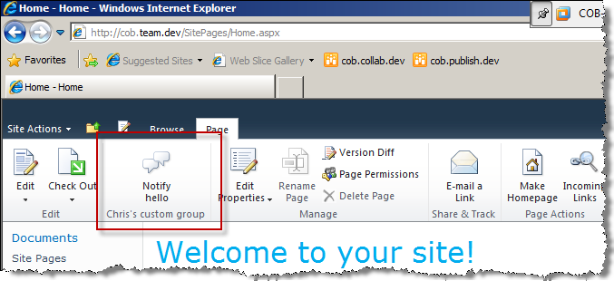
Ribbon.WikiPageTab

Here’s the XML used to get this - you'll notice there’s much less of it compared to last week’s ‘full ribbon’ example:

   1: <?xml version="1.0" encoding="utf-8"?>
   2: <Elements xmlns="http://schemas.microsoft.com/sharepoint/">
   3:   <CustomAction    
   4:       Id="COB.SharePoint.Ribbon.NewGroupInExistingTab"   
   5:       Location="CommandUI.Ribbon">
   6:     <CommandUIExtension>
   7:       <CommandUIDefinitions>
   8:         <CommandUIDefinition Location="Ribbon.Templates._children">
   9:           <GroupTemplate Id="Ribbon.Templates.NewGroupInExistingTab.OneLargeExample">
  10:             <Layout Title="NewGroupInExistingTabOneLarge" LayoutTitle="NewGroupInExistingTabOneLarge">
  11:               <Section Alignment="Top" Type="OneRow">
  12:                 <Row>
  13:                   <ControlRef DisplayMode="Large" TemplateAlias="Button1" />
  14:                 </Row>
  15:               </Section>
  16:             </Layout>
  17:           </GroupTemplate>
  18:         </CommandUIDefinition>
  19:         <CommandUIDefinition Location="Ribbon.WikiPageTab.Scaling._children">
  20:           <MaxSize         
  21:             Id="COB.SharePoint.Ribbon.NewGroupInExistingTab.NotificationGroup.MaxSize"         
  22:             Sequence="15"         
  23:             GroupId="COB.SharePoint.Ribbon.NewGroupInExistingTab.NotificationGroup"            
  24:             Size="NewGroupInExistingTabOneLarge" />
  25:         </CommandUIDefinition>
  26:         <CommandUIDefinition Location="Ribbon.WikiPageTab.Groups._children">
  27:           <Group        
  28:             Id="COB.SharePoint.Ribbon.NewGroupInExistingTab.NotificationGroup"       
  29:             Sequence="15"     
  30:             Description="Used to demo adding a group"      
  31:             Title="Chris's custom group!"   
  32:             Template="Ribbon.Templates.NewGroupInExistingTab.OneLargeExample">
  33:             <Controls Id="COB.SharePoint.Ribbon.NewGroupInExistingTab.NotificationGroup.Controls">
  34:               <Button          
  35:                 Id="COB.SharePoint.Ribbon.NewGroupInExistingTab.NotificationGroup.NotifyHello"     
  36:                 Command="COB.NewGroupInExistingTab.Command.Notify"   
  37:                 Sequence="10"
  38:                 Image16by16="/_layouts/images/NoteBoard_16x16.png" 
  39:                 Image32by32="/_layouts/images/NoteBoard_32x32.png"     
  40:                 Description="Uses the notification area to display a message."  
  41:                 LabelText="Notify hello"               
  42:                 TemplateAlias="Button1" />
  43:             </Controls>
  44:           </Group>
  45:         </CommandUIDefinition>
  46:       </CommandUIDefinitions>
  47:       <CommandUIHandlers>
  48:         <CommandUIHandler       
  49:           Command="COB.NewGroupInExistingTab.Command.Notify"      
  50:           CommandAction="javascript:  SP.UI.Notify.addNotification('Hello from the notification area'); " />
  51:       </CommandUIHandlers>
  52:     </CommandUIExtension>
  53:   </CustomAction>
  54: </Elements>

Points of note:

  • The Location of ‘Ribbon.WikiPageTab.Groups._children’ on the main CommandUIDefinition tells the framework I am adding to the groups collection to the ‘Ribbon.WikiPageTab’ tab. This makes sense as I am adding a group.
  • When adding a group, you must decide whether to use an out-of-the-box GroupTemplate (defines how controls are laid out), or whether you will supply the definition. In this sample I’m using ‘Ribbon.Templates.Flexible’ which is suitable for simple layouts like this (one button!), whereas in the last article I showed creating a custom GroupTemplate. It’s worth spending some time in CMDUI.XML looking at the wide range of existing generic templates before creating your own, but by the same token sometimes it might be simpler just to create one, rather than find an existing one which matches the controls you’re trying to lay out. [Sept 2011 – I agree with Andrew Connell’s statement that it is better to always define your own GroupTemplate. This is because an OOTB template may not always be made available by the framework when you expect it to be.] It soon becomes clear how the XML works here though - the analogy I used last week is using HTML to define a table.
    • Remember that the ‘TemplateAlias’ on your controls must match one defined somewhere in the GroupTemplate – in my example above, I’m using a TemplateAlias of ‘o1’ which I know is defined in 'Ribbon.Templates.Flexible’
  • A ‘MaxSize’ definition must be supplied to the appropriate Scaling collection (i.e. ‘Ribbon.WikiPageTab.Scaling._children’ in this case), though it seems a ‘Scale’ definition is optional (e.g. if you want different controls to be used when less space is available) [Sept 2011 – in fact, ‘Scale’ is invalid here. Specify MaxSize only.]

Adding controls to an existing group:

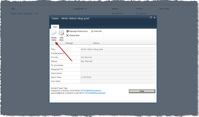
If all we need to do is add a control or two to an existing group on an existing tab, things are simpler still. All we need to do is define the control/specify where it goes (CommandUIDefinition) and add the JavaScript behaviour (a CommandUIHandler element for simple cases – the approach for complex cases is discussed later in the series). For this example I’m adding to ‘Ribbon.ListForm.Display.Manage.Controls._children’ – this is DispForm.aspx (the list item display form), and is a good reminder that ribbons exist in application pages and can be customized there too:

Ribbon.ListForm.Display.Manage

..and here’s the relevant XML:


<?xml version="1.0" encoding="utf-8"?>
<Elements xmlns="http://schemas.microsoft.com/sharepoint/">
  <CustomAction
   Id="COB.SharePoint.Ribbon.NewControlInExistingGroup"
   Location="CommandUI.Ribbon" Sequence="20">
    <CommandUIExtension>
      <CommandUIDefinitions>
        <CommandUIDefinition Location="Ribbon.ListForm.Display.Manage.Controls._children">
          <Button Id="COB.SharePoint.Ribbon.NewControlInExistingGroup.Notify"
                  Command="COB.Command.NewControlInExistingGroup.Notify"
                  Sequence="5" Image16by16="/_layouts/images/NoteBoard_16x16.png" Image32by32="/_layouts/images/NoteBoard_32x32.png"
                  Description="Uses the notification area to display a message."
                  LabelText="Notify hello"
                  TemplateAlias="o1"/>
        </CommandUIDefinition>
      </CommandUIDefinitions>
      <CommandUIHandlers>
        <CommandUIHandler
          Command="COB.Command.NewControlInExistingGroup.Notify"
          CommandAction="javascript:
          
          SP.UI.Notify.addNotification('Hello from the notification area'); 
          " />
      </CommandUIHandlers>    
    </CommandUIExtension>
  </CustomAction>
</Elements>

Points of note:

  • Scaling instructions such as ‘MaxSize’ are not required, nor is a ‘Group' or ‘GroupTemplate’ – since all these apply to groups, which we are not creating
  • As mentioned above, ensure that the ‘TemplateAlias’ on your controls matches one defined somewhere in the GroupTemplate for the parent group. If you’re using one of the ‘Flexible’ templates, ‘o1’ gives a large button whilst ‘o2’ gives a medium one. [Sept 2011 – see earlier comment; always define your own GroupTemplate.] Always check the XML for the target group though, there could be differences.

The ‘Custom Commands’ tab

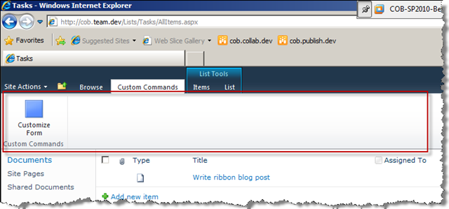
Before rushing off to create your new tab, consider that SharePoint 2010 already provides a home which may be suitable for your customization, for list pages at least – the Custom Commands tab. It only appears on list pages and contains just one lonely button under normal circumstances. This tab is actually the post-upgrade home for any SharePoint 2007 CustomActions you had – assuming you don’t introduce changes during your upgrade process, any CustomActions which didn’t target the ECB will end up here. In any case, it could help avoid tab proliferation so don’t forget it when building your customizations:

CustomCommands 

Creating new contextual tabs

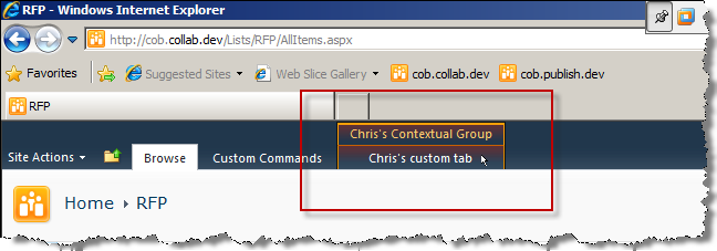
So this section doesn’t quite fit with the theme of this article (adding items to existing areas of the SharePoint ribbon), but I vote we conveniently gloss over that fact. Anyway, in addition to regular tabs, you’ll have noticed that the ribbon also displays many contextual tabs which only appear when relevant. In fact, these are really contextual groups which can contain any number of tabs – perhaps the most common are the ‘List Tools’ (blue, shown in the last screenshot) and ‘Library Tools’ which appear in lists and libraries respectively. If we have custom ribbon controls which we only want to present conditionally, a contextual group could be a good design choice since it would fit well with existing ribbon semantics. They also look rather sexy. As you might expect, we can amend existing contextual groups or create our own:

ContextualGroup

To do this, simply wrap your Tab element(s) in a ‘ContextualGroup’ element (notice the CustomAction element has no RegistrationId/RegistrationType attributes, meaning it is scoped globally) and write some code which runs when the group should be shown. First the declaration of the ContextualGroup and Tab:


<?xml version="1.0" encoding="utf-8"?>
<Elements xmlns="http://schemas.microsoft.com/sharepoint/">
  <CustomAction
   Id="COB.SharePoint.Ribbon.ContextualTab"
   Location="CommandUI.Ribbon">
    <CommandUIExtension>
      <CommandUIDefinitions>
        <CommandUIDefinition Location="Ribbon.ContextualTabs._children">
          <ContextualGroup Id="COB.SharePoint.Ribbon.ContextualGroup" Sequence="50" Color="Orange" Command="COBContextualGroupCommand" ContextualGroupId="COB.Contextual" Title="Chris's Contextual Group">
            <Tab Id="COB.SharePoint.Ribbon.ContextualTab" Title="Chris's custom tab" Description="Groups and controls will go in here" Sequence="501">
            <!-- Add Scaling, Groups, GroupTemplates, CommandUIHandlers etc. in here as per creating a normal tab -->
            </Tab>
          </ContextualGroup>
        </CommandUIDefinition>
      </CommandUIDefinitions>
    </CommandUIExtension>
  </CustomAction>
</Elements>

Here I’m writing server-side code (e.g. from a web part, custom field control, or other custom control), and all you need to do is call SPRibbon.MakeTabAvailable() and SPRibbon.MakeContextualGroupInitiallyVisible(), the latter assuming you want your group to be visible immediately when the page loads:

protected override void OnPreRender(EventArgs e)
{
    SPRibbon currentRibbon = SPRibbon.GetCurrent(this.Page);
    currentRibbon.MakeTabAvailable("COB.SharePoint.Ribbon.ContextualTab");
    currentRibbon.MakeContextualGroupInitiallyVisible("COB.SharePoint.Ribbon.ContextualGroup", string.Empty);
    
    base.OnPreRender(e);
}

In the absence of documentation, equivalent client-side code isn’t immediately obvious but I’ll dig around and update this post when I find it. [Sept 2011 – it seems that contextual tabs/groups can only be made available by server-side code, and note also that SPRibbon is not available in the sandbox.]

In terms of updating an existing contextual group or child tab, the following are defined in CMDUI.XML (contextual groups at level 1, child tabs at level 2), and you can probably identify some of them with things you’ve seen on your SharePoint 2010 travels:

  • Ribbon.EditingTools
    • Ribbon.EditingTools.CPEditTab
    • Ribbon.EditingTools.CPInsert
  • Ribbon.Image
    • Ribbon.Image.Image
  • Ribbon.LibraryContextualGroup
    • Ribbon.Document
    • Ribbon.Library
  • Ribbon.ListContextualGroup
    • Ribbon.ListItem
    • Ribbon.List
  • Ribbon.Link
    • Ribbon.Link.Link
  • Ribbon.Table
    • Ribbon.Table.Layout
    • Ribbon.Table.Design
  • Ribbon.WebPartInsert
    • Ribbon.WebPartInsert.Tab
  • Ribbon.WebPartCtx
    • Ribbon.WebPartOption
  • Ribbon.Calendar
    • Ribbon.Calendar.Events
    • Ribbon.Calendar.Calendar
  • Ribbon.PermissionContextualGroup
    • Ribbon.Permission

Summary

The ribbon is a key building block for SharePoint 2010 solutions, and anywhere you see a ribbon tab it can be customized. This means list pages, the page editing experience, particular application pages, Central Administration and many other locations can be targeted in the same way - identify the ID of the location from CMDUI.XML, then use this in the XML which declares your ribbon customization. In addition to adding items to existing tabs and groups, we also looked at contextual groups, and showed how to conditionally display them with code.

Next time – going beyond simple button customizations with JavaScript page components
Monday 18 January 2010

Customizing the ribbon (part 1) – creating tabs, groups and controls

[This post updated September 2011 with fixes + extra info – see text for details]

In this article series:

  1. Customizing the ribbon – creating tabs, groups and controls (this post)
  2. Adding ribbon items into existing tabs/groups
  3. Ribbon customizations - dropdown controls, Client Object Model and JavaScript Page Components
  4. Customize the ribbon programmatically from web parts and field controls
  5. ** Oct 2011 - Download the code samples in this series (and more) ** 

Some good posts are starting to appear on SharePoint 2010 ribbon customization now, and over the next couple of articles I want to cover some key things you might want to do with the ribbon when developing your solutions. Diving straight in then, some ribbon fundamentals:

  • Ribbon elements must be defined in declarative XML with the CustomAction tag - even if you will actually use code to manipulate them (e.g. make visible, enable/disable etc.)
  • The “control hierarchy” is ribbon > tab > group > controls – we’ll explore all these in this post
  • Individual buttons/controls do not appear and disappear on the ribbon. This is a key ribbon principle, to avoid the “I’m sure this button was here yesterday!” effect - instead, depending on the context:
    • Entire tabs can be shown/hidden
    • Individual controls can be enabled/disabled
    • [Sept 2011 – although SharePoint itself adheres to this guideline, with customization it *is* possible to completely hide ribbon items (though I’d still say this is not recommended due to the inconsistency aspect). Essentially you need to deploy XML which ‘blanks out’ the definition – see Removing a Button from the Server Ribbon on MSDN for more details.]
  • It’s not possible to add custom controls to the ribbon e.g. a custom .ascx/server control. The list of controls defined by the ribbon can be found here in the MSDN docs, and includes things like Button, Checkbox, Color Picker, Combo Box, Dropdown, Textbox, Toggle Button etc, but also some funky ones like Spinner, Split Button and Flyout Anchor (definitions of these exotic varieties can be found in the documentation). FlyoutAnchor is particularly interesting as it takes XML as a datasource and can be used to build interesting “pickers” e.g. with images – I’ll hopefully cover this in detail in a future post
  • The definitions for the out-of-the-box ribbon elements are split across several files in the SharePoint root, with TEMPLATE\GLOBAL\XML\CMDUI.XML being the main one. You will likely spend significant time in this file looking for examples similar to what you’re building.

It’s also worth giving special consideration to how JavaScript plays with the ribbon – it’s used frequently since much happens on the client. Depending on the scope you need for your JavaScript (e.g. every page vs. a couple) and the complexity of what you’re doing, JavaScript can be supplied in a few ways:

  • By embedding it into your declarative XML (via a separate CustomAction with a new ‘Location="ScriptLink"’ attribute) – this post uses this approach, though later in the series I’ll show the next option
  • By deploying a custom .js file which contains some object-oriented JavaScript. This is the approach used for more complex customizations, where you need to create an object which is the client-side “page component” in addition to your XML. The page component supplies the implementation for how your custom ribbon elements should handle various events (“commands”) . This object needs to be derived from the existing CUI.Page.Component object defined in CUI.js. As with any JavaScript file, you then have a couple of options for referencing it on your page.

In this post we’ll show adding JavaScript the first way, though later in the series I’ll show the use of a page component.

Example - creating a new custom tab

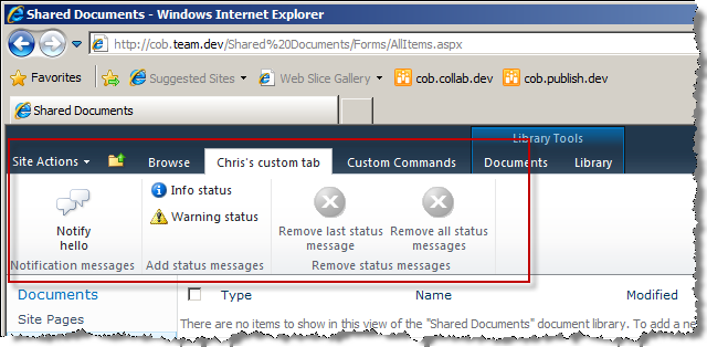
This is a fairly in-depth example, since by necessity it also covers creating custom groups and controls too. Also, to kill two birds with one stone, I thought it would be good to look at the new ‘notifications’ and ‘status’ frameworks in the Client Object Model for passing messages back to the user in your SharePoint app. First we’ll walk through what my custom tab looks like, then what it actually does. I have a tab titled “Chris’s custom tab” with 3 groups (“Notification messages”, “Add status messages” and “Remove status messages”) each with some buttons of different sizes and images in them (N.B. although these screenshots are from the SP2010 beta timeframe, this sample still looks the same):

CustomRibbonTab

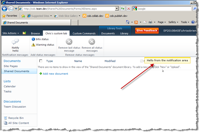
Clicking the ‘Notify hello’ button adds a transient message in the notifications area (fades in from right and stays for 5 seconds by default):

SP.UI.Notify

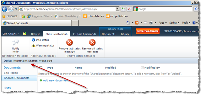
Clicking the ‘Info status’ button shows a status message this time, in the default color (this remains on screen until removed with another API call):

SP.UI.Status_Info

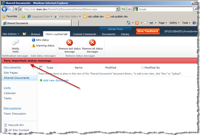
Clicking the ‘Warning status’ button shows a status message of a different color to indicate severity, I chose red:

SP.UI.Status_Warning

You might also have noticed the ‘remove status’ buttons have become enabled when a status message is present – such client-side checks can be done by linking a ‘CommandUIHandler’ with an ‘EnabledScript’ attribute, as we’re about to see.

So what XML is required to get that? Well before you scroll through, note that I’ve taken the complex route with some of the declarations so that my example is as informative as possible – most samples I’ve seen so far simply add a button or two in a single group and don’t specify the "’group template” details which determines how the controls in the group get laid out. This is fine for a button or two as you can just reference an out-of-the-box group template, but if you want to do anything different you’re a bit stuck so hopefully this is good documentation:

   1: <?xml version="1.0" encoding="utf-8"?> 
   2: <Elements xmlns="http://schemas.microsoft.com/sharepoint/"> 
   3:   <CustomAction 
   4:       Id="COB.SharePoint.Ribbon.CustomTab" 
   5:       Location="CommandUI.Ribbon" 
   6:       RegistrationType="List" 
   7:       RegistrationId="101"> 
   8:     <CommandUIExtension> 
   9:       <CommandUIDefinitions> 
  10:         <CommandUIDefinition Location="Ribbon.Tabs._children"> 
  11:           <Tab Id="COB.SharePoint.Ribbon.CustomTab" 
  12:                Title="Chris's custom tab" 
  13:                Description="Groups and controls will go in here" 
  14:                Sequence="550"> 
  15:             <Scaling Id="COB.SharePoint.Ribbon.CustomTab.Scaling"> 
  16:               <MaxSize Id="COB.SharePoint.Ribbon.CustomTab.NotificationGroup.MaxSize" 
  17:                        GroupId="COB.SharePoint.Ribbon.CustomTab.NotificationGroup" 
  18:                        Size="OneLarge"/> 
  19:               <MaxSize Id="COB.SharePoint.Ribbon.CustomTab.StatusGroup.MaxSize" 
  20:                        GroupId="COB.SharePoint.Ribbon.CustomTab.StatusGroup" 
  21:                        Size="TwoMedium"/> 
  22:               <MaxSize Id="COB.SharePoint.Ribbon.CustomTab.RemoveStatusGroup.MaxSize" 
  23:                        GroupId="COB.SharePoint.Ribbon.CustomTab.RemoveStatusGroup" 
  24:                        Size="TwoLarge"/> 
  25:               <Scale Id="COB.SharePoint.Ribbon.CustomTab.NotificationGroup.Scaling.CustomTabScaling" 
  26:                      GroupId="COB.SharePoint.Ribbon.CustomTab.NotificationGroup" 
  27:                      Size="OneLarge" /> 
  28:               <Scale Id="COB.SharePoint.Ribbon.CustomTab.StatusGroup.Scaling.CustomTabScaling" 
  29:                      GroupId="COB.SharePoint.Ribbon.CustomTab.StatusGroup" 
  30:                      Size="TwoMedium" /> 
  31:               <Scale Id="COB.SharePoint.Ribbon.CustomTab.RemoveStatusGroup.Scaling.CustomTabScaling" 
  32:                      GroupId="COB.SharePoint.Ribbon.CustomTab.RemoveStatusGroup" 
  33:                      Size="TwoLarge" /> 
  34:             </Scaling> 
  35:             <Groups Id="COB.SharePoint.Ribbon.CustomTab.Groups"> 
  36:               <Group 
  37:                 Id="COB.SharePoint.Ribbon.CustomTab.NotificationGroup" 
  38:                 Description="Contains notification items" 
  39:                 Title="Notification messages" 
  40:                 Sequence="10" 
  41:                 Template="Ribbon.Templates.OneLargeExample"> 
  42:                 <Controls Id="COB.SharePoint.Ribbon.CustomTab.NotificationGroup.Controls"> 
  43:                   <Button 
  44:                     Id="COB.SharePoint.Ribbon.CustomTab.NotificationGroup.Notify" 
  45:                     Command="COB.Command.Notify" 
  46:                     Sequence="10" 
  47:                     Image16by16="/_layouts/images/NoteBoard_16x16.png" 
  48:                     Image32by32="/_layouts/images/NoteBoard_32x32.png" 
  49:                     Description="Uses the notification area to display a message." 
  50:                     LabelText="Notify hello" 
  51:                     TemplateAlias="cust1"/> 
  52:                 </Controls> 
  53:               </Group> 
  54:               <Group 
  55:                 Id="COB.SharePoint.Ribbon.CustomTab.StatusGroup" 
  56:                 Description="Contains 'add status' items" 
  57:                 Title="Add status messages" 
  58:                 Sequence="20" 
  59:                 Template="Ribbon.Templates.TwoMediumExample"> 
  60:                 <Controls Id="COB.SharePoint.Ribbon.CustomTab.StatusGroup.Controls"> 
  61:                   <Button 
  62:                     Id="COB.SharePoint.Ribbon.CustomTab.StatusGroup.AddStatusInfo" 
  63:                     Command="COB.Command.AddStatusInfo" 
  64:                     Sequence="10" 
  65:                     Image16by16="/_layouts/images/info16by16.gif" 
  66:                     Image32by32="/_layouts/images/info16by16.gif" 
  67:                     Description="Uses the status bar to display an info message." 
  68:                     LabelText="Info status" 
  69:                     TemplateAlias="cust2"/> 
  70:                   <Button 
  71:                     Id="COB.SharePoint.Ribbon.CustomTab.StatusGroup.AddStatusWarning" 
  72:                     Command="COB.Command.AddStatusWarn" 
  73:                     Sequence="20" 
  74:                     Image16by16="/_layouts/images/warning16by16.gif" 
  75:                     Image32by32="/_layouts/images/warning32by32.gif" 
  76:                     Description="Uses the status bar to display a warning message." 
  77:                     LabelText="Warning status" 
  78:                     TemplateAlias="cust3"/> 
  79:                 </Controls> 
  80:               </Group> 
  81:               <Group 
  82:                   Id="COB.SharePoint.Ribbon.CustomTab.RemoveStatusGroup" 
  83:                   Description="Contains 'remove status' items" 
  84:                   Title="Remove status messages" 
  85:                   Sequence="30" 
  86:                   Template="Ribbon.Templates.TwoLargeExample"> 
  87:                 <Controls Id="COB.SharePoint.Ribbon.CustomTab.RemoveStatusGroup.Controls"> 
  88:                   <Button 
  89:                     Id="COB.SharePoint.Ribbon.CustomTab.RemoveStatusGroup.RemoveLastStatusButton" 
  90:                     Command="COB.Command.RemoveLastStatus" 
  91:                     Sequence="10" 
  92:                     Image16by16="/_layouts/images/warning16by16.gif" 
  93:                     Image32by32="/_layouts/images/CRIT_32.GIF" 
  94:                     Description="Removes the last message from the status bar." 
  95:                     LabelText="Remove last status message" 
  96:                     TemplateAlias="cust4"/> 
  97:                   <Button 
  98:                     Id="COB.SharePoint.Ribbon.CustomTab.RemoveStatusGroup.RemoveAllStatusButton" 
  99:                     Command="COB.Command.RemoveAllStatus" 
 100:                     Sequence="20" 
 101:                     Image16by16="/_layouts/images/warning16by16.gif" 
 102:                     Image32by32="/_layouts/images/CRIT_32.GIF" 
 103:                     Description="Removes all messages from the status bar." 
 104:                     LabelText="Remove all status messages" 
 105:                     TemplateAlias="cust5"/> 
 106:                 </Controls> 
 107:               </Group> 
 108:             </Groups> 
 109:           </Tab> 
 110:         </CommandUIDefinition> 
 111:         <CommandUIDefinition Location="Ribbon.Templates._children"> 
 112:           <GroupTemplate Id="Ribbon.Templates.OneLargeExample"> 
 113:             <Layout Title="OneLarge" LayoutTitle="OneLarge"> 
 114:               <Section Alignment="Top" Type="OneRow"> 
 115:                 <Row> 
 116:                   <ControlRef DisplayMode="Large" TemplateAlias="cust1" /> 
 117:                 </Row> 
 118:               </Section> 
 119:             </Layout> 
 120:           </GroupTemplate> 
 121:         </CommandUIDefinition> 
 122:         <CommandUIDefinition Location="Ribbon.Templates._children"> 
 123:           <GroupTemplate Id="Ribbon.Templates.TwoMediumExample"> 
 124:             <Layout Title="TwoMedium" LayoutTitle="TwoMedium"> 
 125:               <Section Alignment="Top" Type="TwoRow"> 
 126:                 <Row> 
 127:                   <ControlRef DisplayMode="Medium" TemplateAlias="cust2" /> 
 128:                 </Row> 
 129:                 <Row> 
 130:                   <ControlRef DisplayMode="Medium" TemplateAlias="cust3" /> 
 131:                 </Row> 
 132:               </Section> 
 133:             </Layout> 
 134:           </GroupTemplate> 
 135:         </CommandUIDefinition> 
 136:         <CommandUIDefinition Location="Ribbon.Templates._children"> 
 137:           <GroupTemplate Id="Ribbon.Templates.TwoLargeExample"> 
 138:             <Layout Title="TwoLarge" LayoutTitle="TwoLarge"> 
 139:               <Section Alignment="Top" Type="OneRow"> 
 140:                 <Row> 
 141:                   <ControlRef DisplayMode="Large" TemplateAlias="cust4" /> 
 142:                   <ControlRef DisplayMode="Large" TemplateAlias="cust5" /> 
 143:                 </Row> 
 144:               </Section> 
 145:             </Layout> 
 146:           </GroupTemplate> 
 147:         </CommandUIDefinition> 
 148:       </CommandUIDefinitions> 
 149:       <CommandUIHandlers> 
 150:         <CommandUIHandler 
 151:             Command="COB.Command.Notify" 
 152:             CommandAction="javascript: var notificationId = SP.UI.Notify.addNotification('Hello from the notification area'); " /> 
 153:         <CommandUIHandler 
 154:             Command="COB.Command.AddStatusInfo" 
 155:             CommandAction="javascript:                    
 156:               var statusId = SP.UI.Status.addStatus('Quite important status message');         
 157:               visibleStatusIds.push(statusId); 
 158:               enableRemoveStatusButton(); 
 159:               RefreshCommandUI();" /> 
 160:         <CommandUIHandler 
 161:             Command="COB.Command.AddStatusWarn" 
 162:             CommandAction="javascript: 
 163:               var warnStatusId = SP.UI.Status.addStatus('Very important status message'); 
 164:               SP.UI.Status.setStatusPriColor(warnStatusId, 'red');   
 165:               visibleStatusIds.push(warnStatusId); 
 166:               enableRemoveStatusButton(); 
 167:               RefreshCommandUI(); " /> 
 168:         <CommandUIHandler 
 169:             Command="COB.Command.RemoveLastStatus" 
 170:             EnabledScript="javascript: enableRemoveStatusButton();" 
 171:             CommandAction="javascript:             
 172:               SP.UI.Status.removeStatus(visibleStatusIds[visibleStatusIds.length - 1]);   
 173:               visibleStatusIds.pop(); 
 174:               enableRemoveStatusButton(); 
 175:               RefreshCommandUI();" /> 
 176:         <CommandUIHandler 
 177:             Command="COB.Command.RemoveAllStatus" 
 178:             EnabledScript="javascript: enableRemoveStatusButton();" 
 179:             CommandAction="javascript:           
 180:               SP.UI.Status.removeAllStatus(true);        
 181:               visibleStatusIds.length = 0; 
 182:               enableRemoveStatusButton(); 
 183:               RefreshCommandUI();" /> 
 184:       </CommandUIHandlers> 
 185:     </CommandUIExtension> 
 186:   </CustomAction> 
 187:   <CustomAction 
 188:     Id="COB.Command.RemoveLastStatus.CheckEnable" Location="ScriptLink" 
 189:     ScriptBlock="          
 190:       var visibleStatusIds = [];                           
 191:       function enableRemoveStatusButton()  {   
 192:           return (visibleStatusIds.length > 0);        
 193:       }" /> 
 194: </Elements>

Some key points, following the XML sequence:

  • CustomAction:
    • Notice I have two CustomAction elements – one for the ribbon elements, the other for some JavaScript I want to use with my custom elements. This is the approach mentioned earlier where the JavaScript is effectively embedded in your XML [sidenote: you don’t have to be doing ribbon customization to leverage this approach - this use of CustomAction is a new way of providing JavaScript to the page, just be aware it will be added for every page in the Feature scope (e.g. site/web) and you have no control over where in the page it will be injected. It does give you the ability to take away your JavaScript via Feature deactivation though, which could be useful for many scenarios).
      • The Location attribute of CustomAction for ribbon elements should always be “CommandUI.Ribbon”
      • The Location attribute of CustomAction for script is a new value, “ScriptLink”
    • My ribbon tab is scoped to document libraries only – this is courtesy of the RegistrationType="List" RegistrationId="101" attributes (which is exactly what you did when targeting a CustomAction to doc libs in SharePoint 2007, no change there)
    • When targeting a list in this way, RegistrationId refers to the list template ID (e.g. generic list = 100. document library = 101 etc. – here’s a full list of template IDs) – it is not possible to declaratively target a list by e.g. GUID or URL. So consider that this could drive you to create a list template when you otherwise might not have, or define a contextual tab which is shown only under specific circumstances.
    • Other options for the RegistrationType continue to be “ContentType”, “ProgID” and “FileType”, but I’m pretty sure only “List” can be used for ribbon elements, but I’ve not tested that yet so I reserve the right to be wrong! [Sept 2011 – RegistrationType=”ContentType also works.] If you want a different scope level, you would omit the RegistrationType and RegistrationId attributes and use code such as SPRibbon.MakeTabAvailable() to conditionally show the ribbon – typically this would be a ‘contextual’ tab. More on this later in the series when I show how to add ribbon customizations for a web part or custom field control.
  • CommandUIDefinition:
    • Another element you might have multiple of – one for the main customization definition, one for each of the “GroupTemplate” elements being provisioned (more on this later). For the main one, the “Location” attribute here is crucially important as this specifies where the customization should appear. My value of “Ribbon.Tabs._children” indicates I’m adding something into the “Ribbon.Tabs” collection defined by SharePoint (typically in CMDUI.XML) – “_children” is a convention used when adding to many collections in the ribbon architecture. We’ll look at how to add new groups and controls into an existing group in the next article, but as a quick example, adding a group into “Ribbon.Library.Groups._children” would make your group appear somewhere in the groups for the ‘Ribbon.Library’ tab, shown below (where exactly will depend on the “Sequence” number of the group):
      Ribbon.Library.Groups
  • Tab:
    • The “Sequence” attribute decides where to place my tab amongst the existing ones (and in general defines where an item should slot in compared to it’s siblings). Out-of-the-box values are generally multiples of 10, occasionally of 5, so your sequence values should avoid such numbers to avoid conflict. Generally you’ll need to find the declaration of the surrounding elements near where you are targeting (usually in CMDUI.XML) to find the appropriate number.
  • Scaling (and children):
    • This section defines how your elements should behave when the window is resized and there’s not enough room. You need a “MaxSize” and “Scale” element for each Group you define. These define the size and layout the element(s) should be at when at “max”, and also what to change to when the window is smaller – effectively you can provide multiple layouts for your controls depending on the window size (e.g. prioritising the important buttons). This is an extremely cool and useful feature of the SharePoint ribbon. [Sept 2011 – note that these elements should be sequenced MaxSize, MaxSize, Scale, Scale (as mentioned in the comments below). This changed from beta to RTM, and is now reflected in my code sample above.]
  • Group:
    • This is the “section on the ribbon tab” which is the container for your controls – in the small image above, an example of a Group is ‘View Format’ which contains the two leftmost buttons. Key things here are the “Sequence” (same deal as elsewhere) and the “Template” – this is a reference to a “GroupTemplate” element (which we’ll come onto shortly). In essence, this is the link which will tell the ribbon framework how to lay out the controls in this group.
  • Controls:
    • Fairly obvious, this is the parent node for any controls you want to add e.g. buttons, dropdowns etc etc. Note that each of your controls in here must have a “TemplateAlias” attribute – this tells the framework exactly where to place the individual control within the GroupTemplate which is referenced.
    • Controls expose various commands, via attributes – a Button simply has a “Command” attribute which fires when clicked, whereas a Dropdown has additional ones such as “PopulateQueryCommand” and “QueryCommand". These link to “CommandUIHandler” elements or code defined in a JavaScript page component.
  • GroupTemplate:
    • Similar to defining say, a HTML table, this section provides the actual layout of the controls, alignments, control sizes etc. Each control which is being declared needs a corresponding “ControlRef” element which will be matched to the control on the “TemplateAlias” value. [Sept 2011 – by the way, I agree with Andrew Connell’s assertion that although you can avoid having to define GroupTemplates by using ones defined by Microsoft, this should be avoided since the template may not always be available.]
  • CommandUIHandler:
    • This is the where you get to define the JavaScript which executes when the basic “Command” is fired for a control (e.g. a button is clicked) – remember however, that this is just one way to provide the JavaScript – the other way is to use a page component (as described in the 3rd article in this series). Using this approach, the command name must match that defined on the Control element, and the “CommandAction” attribute contains the script for the basic command. You can also use the “EnabledScript” attribute to add some script which decides whether the control should be enabled or not – this is how my '’remove status’ buttons are only enabled when there is a message to remove.
    • Since all the JavaScript gets added to the same page, as you’ll see in my sample it is possible to declare variables which get used by other JavaScript provisioned by a different CommandUIHandler – again though, whilst the sequence is deterministic you cannot control where your script gets added into the overall page (at the start of the <body> tag), so if you need your code to run when the DOM is complete you’d have to take steps to get your code called at the appropriate time – this is effectively the page component approach, more on this later in the series.

Hope you found this useful. Next time we’ll take a quick look at adding items to existing ribbon locations, before moving onto working with JavaScript and page components etc.